
LOCH Technologies
Geospatial analytics, visualization architecture, and performance.
Senior Frontend Software Engineer, 2023-2024
Overview
At LOCH Technologies, I built frontend experiences for geospatial analytics and visualization-heavy workflows. The product needed to make dense technical data readable, interactive, and useful for people making decisions from live or complex datasets.
My Role
I worked as a Senior Frontend Software Engineer, building React and Preact interfaces, interactive maps, reporting flows, and reusable visualization patterns. I collaborated closely with backend engineers to connect frontend views with geospatial and analytics data sources.
Technical Highlights
The application was built on a Ruby/Jinja architecture. Rather than migrating the entire application to React, we introduced Preact for new interactive features because it provided a lightweight integration with the existing stack. I also built visualizations with Mapbox GL, D3.js, Canvas.js, and eCharts, and implemented dynamic PDF reporting features.
Challenges
As data density increased, the D3 implementation began creating too many DOM elements, causing browser performance issues. I evaluated alternatives and replaced that visualization with a Canvas-based implementation that handled continuous streaming data much more efficiently.
What I've Learned
Building complex visualizations taught me that good frontend engineering isn't just about making interfaces look good. It's about making difficult technical problems feel effortless to the user.
Visualization case study
Designing a performant real-time SDR waterfall
The work began by collaborating with backend engineers to understand what users needed from the incoming radio-frequency data, how much of it should be delivered, and where it could be reduced without losing the most valuable signal. That shared data contract then informed the D3 and Canvas rendering architecture on the frontend.
Baseline
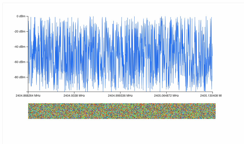
Start by defining the useful signal
This first data iteration helped frame the product question: how much data should reach the user, and which parts are most valuable for interpreting the signal? I worked with backend engineers to shape that contract before optimizing how the frontend rendered it.
Rendering architecture
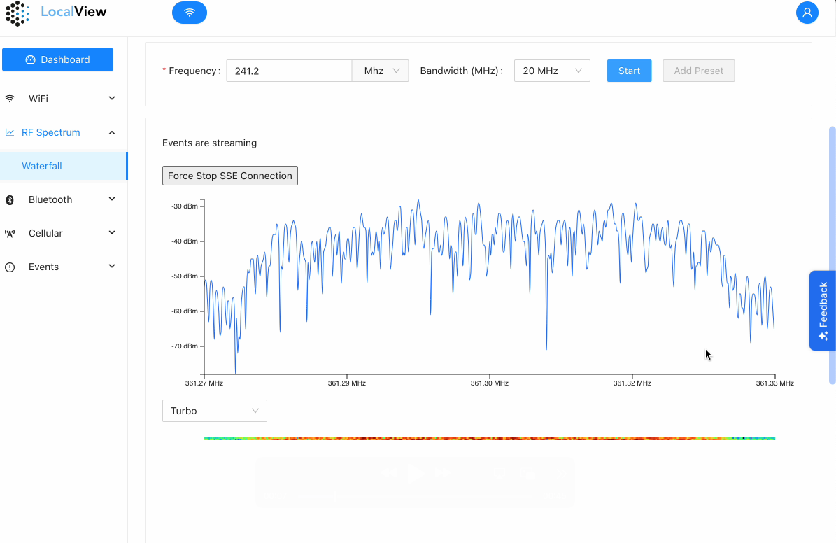
D3 for meaning, Canvas for density
D3 manages scales, axes, and the readable spectrum line. Canvas renders the pixel-dense waterfall as a bitmap, avoiding a DOM or SVG element for every sample and historical cell.
Data optimization
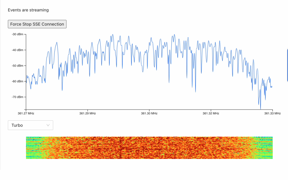
Remove complexity before rendering
The visualization reduces samples to the screen’s useful resolution, normalizes the display range, and keeps a bounded rolling history. The result preserves signal shape without pushing redundant data through React or the renderer.
Product experience
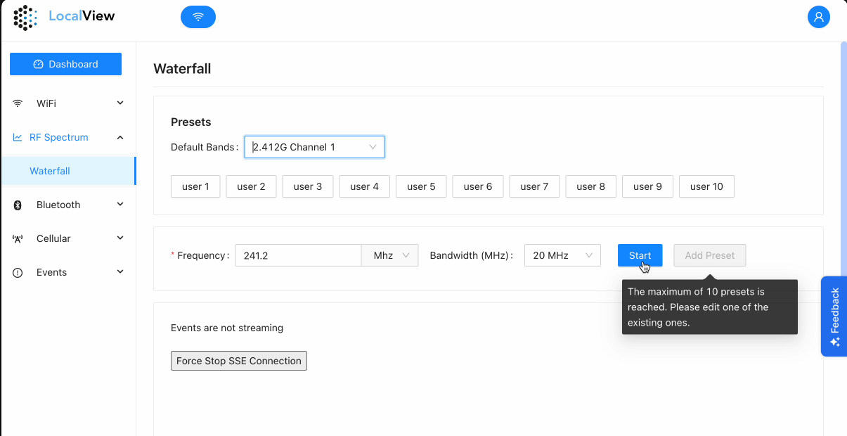
Keep streaming controls understandable
Frequency, bandwidth, presets, connection state, and limits remain visible around the chart so performance work supports the task instead of turning the visualization into an isolated demo.
Performance model
- Prioritize
Agree with backend engineers on which data is most valuable to users before deciding what the interface needs to render.
- Bound
Keep a fixed rolling history instead of allowing the waterfall dataset to grow indefinitely.
- Separate
Let React manage controls and state while imperative drawing handles the high-frequency render loop.
- Render
Use D3 where semantic scales and interaction matter; use Canvas where pixel throughput matters.
Interview Q&A
Tell me about the Mapbox project.
The work involved building geospatial interfaces where users could inspect and reason about complex location-based data. Mapbox GL provided the map foundation, while the frontend architecture handled interactive layers, filtering, and related analytics views.
Why did you use Preact instead of a full React migration?
The existing app used Ruby and Jinja, so a full migration would have been expensive and risky. Preact gave us a pragmatic path to add modern interactive features without disrupting the whole system.
How did you handle large datasets?
When DOM-heavy D3 rendering began to strain performance, I moved the dense visualization work to Canvas. That reduced the number of DOM nodes and made the interface better suited for continuous streaming data.
What was the biggest frontend challenge?
The biggest challenge was turning dense technical data into an interface that felt responsive and understandable. That meant thinking about rendering performance, interaction design, and data clarity together.